Showing posts with label colours. Show all posts

Monday, 22 February 2016

Feeling Sad, Feeling Blue?


"Our results show that mood and emotion can affect how we see the world around us," lead author psychology researcher Christopher Thorstenson​ said. "Our work advances the study of perception by showing that sadness specifically impairs basic visual processes that are involved in perceiving colour."

The link between colour and emotion is well known.

Dark, muted colours tend to be associated with sadness and disgust, while bright, saturated colours are perceived as happy and clean.

Colours like red and orange are seen as "warm" and comforting, but can also be associated with feelings of anger and hostility.

Colours like blue and purple are seen as "cool" and calming, but can also be associated with sadness or indifference.

Occasionally, if we're down we want to watch a comedy, be surrounded by bright colours or listen to a happy song, but generally, we prefer colours, sounds and visuals that reflect the way we feel.

Why? Researchers suggest this depends on how "deep" the sadness is.

For example, if we have lost a loved one or suffered a serious emotional trauma, lighthearted stimulus, in any form, can be perceived as inappropriate and even "threatening to one's beliefs".

If, on the other hand, we've just had a bad day, a little lightness is likely to lift us back up.

In the new study, the researchers extended on this existing knowledge.

"We thought that maybe a reason these metaphors emerge was because there really was a connection between mood and perceiving colours in a different way," Thorstenson said.

To find out, he conducted two experiments. In the first, 127 participants watched either a very funny or very sad video to set the mood.

They were then shown 48 consecutive, desaturated colour patches and were asked to name whether it was red, yellow, green, or blue.

Those who watched the sad clip were less accurate in identifying the colours, but only with colours that were on the blue-yellow axis.

In the second experiment, 130 participants watched a neutral or sad clip. Again, those who watched the sad video were less able to accurately identify colours on the blue-yellow axis.

"We were surprised by how specific the effect was, that colour was only impaired along the blue-yellow axis," Thorstenson says. "We did not predict this specific finding, although it might give us a clue to the reason for the effect in neurotransmitter functioning."

The researchers hypothesise that it may have to do with a relationship between the neurotransmitter dopamine and the blue-yellow axis, but say more research is required.

"This is new work and we need to take time to determine the robustness and generalisability of this phenomenon before making links to application," he says.

Colours have been used as therapy in Eastern cultures and have cross-cultural associations with emotion.


Red is the colour of both love and warmth, as well as anger.

RED
Red is used to stimulate the body and mind and to increase circulation in chromotherapy.
Red is the colour of love, warmth, and comfort. Red is also considered an intense, angry, colour associated with excitement.
One study found that seeing the colour red before taking an exam actually had a negative impact on test performance.

YELLOW
Yellow is thought to stimulate the nerves and purify the body.
Yellow is considered to be cheery and warm, but is also associated with frustration and anger. Research has shown that people are more likely to lose their tempers and babies tend to cry more in yellow rooms.
ORANGE
Orange is used to heal the lungs and to increase energy levels.
Orange calls to mind feelings of excitement, enthusiasm, and warmth.

BLUE
Blue is associated with soothing illnesses and treating pain.
Blue is is considered to be calming and serene, but is also associated with sadness and aloofness.
Research has shown that people are more productive in blue rooms.

PURPLE
Purple shades are thought to alleviate skin problems.

Purple represents wisdom and spirituality. It does not often occur in nature, it can sometimes appear exotic or artificial

Within each basic emotion there are levels of that emotion which range from less intense on the outside to more intense in the center. For example, levels of angry are shown as:


Visually, it might help to think of basic emotions as levels of color that become more intense as they pull inward towards the circle center. Brighter, bolder colors are associated with more intense emotions. The most intense emotions are demonstrated by people less often and are contained within a smaller visual space near the dark center. Less intense emotions are on the outside.


Thursday, 11 February 2016

Colour harmony

What is Color Harmony?

Its nature's way of saying that two or more things work together.  It represents a satisfying balance or unity of colours.  Combination that exist in harmony are pleasing to the brain. The human brain distinguishes the visual interest and the sense of order created by the harmony and forms a dynamic equilibrium. The human brain distinguishes the visual interest and the sense of order created by the harmony and forms a dynamic equilibrium.

With colours you can set a mood, attract attention, or make a statement. You can use color to energize, or to cool down. By selecting the right color scheme, you can create an ambiance of elegance, warmth or tranquility, or you can convey an image of playful youthfulness. Color can be your most powerful design element if you learn to use it effectively.

Colors affect us in numerous ways, both mentally and physically. A strong red color has been shown to raise the blood pressure, while a blue color has a calming effect.  Being able to use colors consciously and harmoniously can help you create spectacular results.


The Colour Wheel

Color wheel
The color wheel or color circle is the basic tool for combining colors. The first circular color diagram was designed by Sir Isaac Newton in 1666.  The color wheel is designed so that virtually any colors you pick from it will look good together. Over the years, many variations of the basic design have been made, but the most common version is a wheel of 12 colors based on the RYB (or artistic) color model.
Traditionally, there are a number of color combinations that are considered especially pleasing. These are called color harmonies or color chords and they consist of two or more colors with a fixed relation in the color wheel.

ColorImpact is designed to dynamically create a color wheel to match your base color.

complementaryComplementary color scheme
Colors that are opposite each other on the color wheel are considered to be complementary colors (example: red and green).
The high contrast of complementary colors creates a vibrant look especially when used at full saturation. This color scheme must be managed well so it is not jarring.

Complementary color schemes are tricky to use in large doses, but work well when you want something to stand out.


analogousAnalogous color scheme
Analogous color schemes use colors that are next to each other on the color wheel. They usually match well and create serene and comfortable designs.
Analogous color schemes are often found in nature and are harmonious and pleasing to the eye.
Make sure you have enough contrast when choosing an analogous color scheme.

Choose one color to dominate, a second to support. The third color is used (along with black, white or gray) as an accent.

Colour & What You Wear

Colour Matters for What You Wear

You will probably feel good wearing your favourite colour. Clothes become a second skin. One sends out a message when we wear certain colours. What message are we sending out?
One of the most common examples of colour symbolism is the custom of using pink for girls and blue for boys. This tradition emerged at the turn of the 20th century. Pink was always thought as a strong colour, and more suited for boys. Blue was delicate and dainty and more suited for girls. In 1921, the Women's Institute for Domestic Science in Pennsylvania endorsed pink for boys, blue for girls.

In Belgium, pink is used for baby boys and blue is used for baby girls. In Bermuda, pink is considered a very masculine colour. British bakers and barrister have worn pink shirts for decades.
Pink goes in and out of fashion all the time. 


What colours are worn for weddings 


White is the traditional colour for a bride's wedding gown White symbolizes purity and innocence.

In Asia, white is the colour of death. This arises from the belief that death is seen as a beginning and that white represents the purity that the deceased brings into the next life. Brides in Japan and China wear red in traditional wedding ceremonies.

White is also associated with death in India, where widows wear white. In India, red or pink saris are the most popular colours for brides.


 What colours are worn for funerals

Black symbolizes death and is the traditional colour of mourning. Black clothing is associated with powerful forces in many parts of the world. Bad and good. Witches, the devil, ninjas, cat burglars, Darth Vader, CatWoman, and Batman wear black....and so do priests, nuns, judges, mimes, Mennonites, Bedouins, and monks.

Maybe the common thread is that these people are signaling their seriousness of purpose - or the need to be hard to see - or both. 


What colours should you wear to an interview?

Colours can send a massage during an interview, so what colours should you wear?
Blue is an safe colour, avoid brown altogether, black conveys leadership. Red send a message of power but not in a good way.  Gray is a safe colour.  Don't wear orange.  White sends the message that you are organised and detailed orientated.  Purple and yellow are for interviews in the creative sense.


What colours should redheads wear

GREEN: Green hues look amazing on all redheads; from emerald to teal, these shades are stunning when paired with red hair.

PURPLE: Remember art class? Purple compliments red

BLUE: Cobalt, navy and light blue

RED: There is an old adage that redheads should never actually wear red.The key is to find a red tone that works with your skin tone and shade of hair. s. 


Tuesday, 9 February 2016

Meaning of different colours

Colors often have different meanings in various cultures. And even in Western societies, the meanings of various colors have changed over the years.

Black
Black is the colour of authority and power. It is popular in fashion because it makes people appear thinner. It is also stylish and timeless. Black also implies submission. Priests wear black to signify submission to God. Some fashion experts say a woman wearing black implies submission to men. 


White

Brides wear white to symbolize innocence and purity. White reflects light and is considered a summer color. White is popular in decorating and in fashion because it is light, neutral, and goes with everything. However, white shows dirt and is therefore more difficult to keep clean than other colors. Doctors and nurses wear white to imply sterility.


Red-The most emotionally intense colour, red stimulates a faster heartbeat and breathing. It is also the colour of love. Red clothing gets noticed and makes the wearer appear heavier. Since it is an extreme color, red clothing might not help people in negotiations or confrontations. Red cars are popular targets for thieves. In decorating, red is usually used as an accent. Decorators say that red furniture should be perfect since it will attract attention.


Pink
The most romantic color, pink, is more tranquilizing. Sports teams sometimes paint the locker rooms used by opposing teams bright pink so their opponents will lose energy.


Blue
The color of the sky and the ocean, blue is one of the most popular       colors. It causes the opposite reaction as red. Peaceful, tranquil blue causes the body to produce calming chemicals, so it is often used in bedrooms. Blue can also be cold and depressing. Fashion consultants recommend wearing blue to job interviews because it symbolizes loyalty. People are more productive in blue rooms. Studies show weightlifters are able to handle heavier weights in blue gyms.


Green
Currently the most popular decorating color, green symbolizes nature. It is the easiest color on the eye and can improve vision. It is a calming, refreshing color. People waiting to appear on TV sit in "green rooms" to relax. Hospitals often use green because it relaxes patients. Brides in the Middle Ages wore green to symbolize fertility. Dark green is masculine, conservative, and implies wealth. However, seamstresses often refuse to use green thread on the eve of a fashion show for fear it will bring bad luck.


Yellow

Cheerful sunny yellow is an attention getter. While it is considered an optimistic color, people lose their tempers more often in yellow rooms, and babies will cry more. It is the most difficult color for the eye to take in, so it can be overpowering if overused. Yellow enhances concentration, hence its use for legal pads. It also speeds metabolism.


Purple

The color of royalty, purple connotes luxury, wealth, and sophistication. It is also feminine and romantic. However, because it is rare in nature, purple can appear artificial.


Brown

Solid, reliable brown is the color of earth and is abundant in nature. Light brown implies genuineness while dark brown is similar to wood or leather. Brown can also be sad and wistful. Men are more apt to say brown is one of their favorite colors.

Colours in Nature


Warning colouration

Animals that are dangerous, or foul to eat, usually advertise the fact. This is called warning colouration or aposematism. It is the exact opposite of camouflage. Warning colours tend to be some combination of red, yellow, black and white.
Alfred Russel Wallace, a British naturalist, explained it this way, in 1889:
"The animals in question are possessors of some deadly weapons, as stings or poison fangs, or they are uneatable, and are thus so disagreeable to the usual enemies of their kind that they are never attacked when their peculiar powers or properties are known.
It is, therefore, important that they should not be mistaken for defenceless or eatable species... since they might suffer injury, or even death, before their enemies discovered the danger or uselessness of their attack. They require some signal or danger flag which shall serve as a warning to would-be enemies..." 
Wallace predicted that birds and other predators would reject conspicuous prey whilst accepting cryptic prey. Later reports confirmed this.
Animals with warning colours move slowly and expose themselves to sight. The sluggishness and exposure helps to advertise their defence. Along with the colour and behaviour often goes the foul smell of their chemical weapons. Noxious caterpillars often have thick, leathery cuticles which help them to resist young birds making a 'test'. When the bird takes a peck, disgusting fluid seeps out from special glands on its back. The caterpillar (or other larva) will often survive such an attack, and the young bird has learnt a lesson it will never forget. All in all, the predator is given good warning. Tests show that warning colours definitely do deter predators.
Some individual animals will die or receive damage while birds or mammals on the attack learn about the connection between colour and taste. However, if warning costs less than hiding, the animal benefits. And the advertising traits such as colours may serve other functions as well. The patterns may help mate identification within the species, for instance.
Warning colouration is the basis of two different kinds of mimicry: Müllerian mimicry and Batesian mimicry.

Bright colours
Animals can, and do, show bright colours which have other functions. The most common functions are:
However, the bright colours used for these functions tend to be different from the standard warning patterns and colours.

Use of pigments for camouflage or defense

Pigmentation is used by many animals for protection, by means of camouflage, mimicry, or warning coloration. Pigments such as melanins in the skin may serve to protect tissues from ultraviolet radiation.

The skin of an octopus changes almost immediately as it moves over different colored areas of the ocean floor. Color changes are controlled by small, elastic, pigment-filled sacs, known as chromatophores, found in the outer layer of the skin. The sacs are filled with red, yellow, or brown pigment, with some species having as many as five colors. When the muscles attached to each chromatophore contract, they pull the pigment sac outward to reveal an area of a particular color. When the muscles relax, the chromatophores close back up. The ink clouds a cephalopod produces complement this line of defense.


A secondary sex characteristic to find a mate
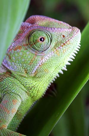
Pigments may also aid in sexual reproduction, by identifying species and gender of animals to potential mates, or signaling readiness to breed. It is now believed that chameleons change color not so much to blend into the surroundings, but rather to signal, fend off rivals, or attract a mate.


Temperature regulation and protection by colour
Some animals are coloured for physical protection, such as having pigments in the skin to protect against sunburn, while some frogs can lighten or darken their skin for temperature regulation.
Nov/2014 - Bokermannohyla alvarengai
Some frogs such as Bokermannohyla alvarengai, which basks in sunlight, lighten their skin colour when hot (and darkens when cold), making their skin reflect more heat and so avoid overheating.


Unknown function of colours
Crimson Speckled Moth by Faunamelitensis
The colouring of many species has unknown function. This is usually because their life habits have not been studied sufficiently, and because no field tests have been done. One example is the extraordinary moth Utetheisa pulchella, the Crimson Speckled Moth. Its association with the plant Dittrichia viscosa, which has a somewhat unpleasant smell, suggest the moth has warning colouration, but the matter is not settled. The related species Utetheisa ornatrix, which feeds on other plants, is known to exude (squeeze out) alkaloids to put predators off.